UK cover US cover
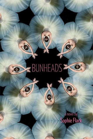

I've liked the US cover on the right since I first clapped eyes on it on a Waiting on Wednesday post. While I know it's the same image produced multiple times, I like the pattern made by all the white tutus. They almost create an optical illusion - at first glance, they can look like flowers or swans and you have pay attention to see that they are ballerinas. I also think that the identical images, striking identical poses gives a much clearer feeling that they are indeed, dancing and in perfect unison.
By having an isolated image, the UK cover on the left loses that feeling and it appears that the ballerina is hunched on the floor in anguish. I have a sneaking suspicion that the UK publishers are trying to call to mind Black Swan and play up the emotional distress a ballet career can cause. Adding that tagline also seems to reinforce this. What gets me though, is that the line: "On a stage full of beautiful dancers, how can one girl stand out?" would be much better illustrated by the US cover.
The UK cover is OK and I don't mind having that edition, but I have much more admiration for the image on the US one.
Oh wow, you're so right. I tend to like the UK covers more on books, but the multitude of identical dancers is such a perfect illustration for this book! Also I like the slight (I think) photoshopping of the dancers to make those elongated arms and emphasize the near-impossible level of perfection demanded.
ReplyDeleteI was drawn to this book firstly because of the cover, and secondly because I love dance related film and books (Center Stage, anyone?). Such a lovely cover, can't wait to read it!
ReplyDeleteI agree with you too, the US cover is beautiful and gives a feeling of harmony and grace.
ReplyDeleteI totally agree with you that the tagline would suit the US cover better. I'll pop on my marketing hat and say that that tagline plus the Us cover plus making one dancers dress a different colour would have been awesome. The UK (and probably the Australian cover by association) looks too much like another generic ballet story :(
ReplyDeleteI agree..the tagline is definitely more suited to the US cover. Although the UK cover is nice....I still prefer the US one because of the whole optical illusion effect
ReplyDelete